Temperature
This Fact Page displays text and images related to global warming and climate change
(Hover your mouse over the text below to "popup" a window with a related text.
Click on the text or image to open a new window with a detailed description.)
|
|
| | | | | | | | | | | | | | | | | | | | | | | | | El Niño/La Niña Global Surface Temperature Influence - 1967-2012Snce El Nino and La Nina have such an impact on global atmospheric temperatures, the best way to look at the atmospheric temperature change is to categorize the global temperature by “type of year”, which indicates that the atmospheric temperatures have been increasing at the same steady rate (about .16°C /decade) since 1970 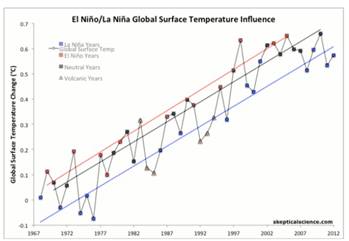 | | | | | | | | | | | | | | | | | | | | | | | | | | | | | | | | | | | | | | | | | | | | | | | | | | | | | | | | | | | | | | | | |
| Drought and immunity determine the intensity of West Nile virus epidemics and climate change impacts | | Figure 1.Mechanisms influencing WNV transmission. | 
(a) Variables (blue) that influence human WNND cases (red) either positively (green arrows) or negatively (black arrows), either directly, or via effects on mosquito populations (purple). Note that it is the product of mosquito abundance and prevalence that determines risk to humans. (b–e) The fitted relationships for the temperature-dependent (b) biting rate , (c) mortality rate , and (d) the inverse of the extrinsic incubation period (L.D.K., A. C. Matacchiero, A.T. Ciota & A.M.K. 2013, unpublished data) were used to generate (e) the resulting estimated relationships between temperature and partial-R0 for West Nile virus for C. tarsalis (triangles, dashed lines), C. pipiens (circles, solid lines) and C. quinquefasciatus (cross-hatches, dotted lines; see Material and methods). (Online version in colour.) | | | URL: http://carbonbrief.us2.list-manage.com/track/click?u=39b25e6afa81d7ffc0e925ee9&id=ad7e6061a2&e=bf36e91829 |
| Drought and immunity determine the intensity of West Nile virus epidemics and climate change impacts | | Figure 2.Climate and immunity correlations with annual state WNND cases. | 
The effect of (a) immunity (cumulative incidence; coeff. = -2.05, F1,300 = 96.42, p < 0.001), (b) precipitation (coeff. = -0.0009, F1,161 = 2.20, p = 0.14), (c) drought (coeff. = -0.14, F1,274 = 27.01, p < 0.001), (d) winter severity (coeff. = -0.05, F1,34 = 2.95, p = 0.09), (e) temperature (PIP: coeff. = 0.06, F1,276 = 2.58, p = 0.10; TAR: coeff. = 0.22, F1,144 = 53.59, p < 0.001; QUI: coeff. = 0.002, F1,104 = 0.0005, p = 0.98) and (f) temperature modelled as the relative R0 value at a given temperature (coeff. = 1.66, F1,121 = 17.33, p < 0.001) on the total logged number of WNND cases (adjusted for state random effects) in a given state and year (1999–2013). In (a–d,f), the filled red points and fitted lines are univariate regressions for states in which that predictor was significant (a < 0.05), while open black points depict states in which the predictor was not significant. In (e), green crosses, blue circles and green triangles denote states where C. tarsalis, C. pipiens and C. quinquefasciatus, respectively, dominate transmission and the relationship is only significant for C. tarsalis. (Online version in colour.) | | | URL: http://carbonbrief.us2.list-manage.com/track/click?u=39b25e6afa81d7ffc0e925ee9&id=ad7e6061a2&e=bf36e91829 |
| Annotated
Global Average 1850-2017 | 
Chart
Source: https://climatecrock.files.wordpress.com/2018/01/globaltempsbest17.jpg | | | Source: NASA |
| Arctic and Global Temperature Anomoly | 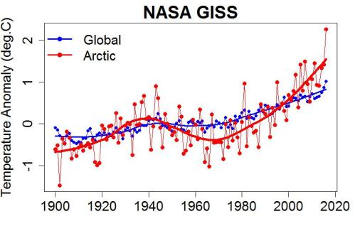 | But — not all parts of it are heating up at the same rate. Temperature in the Arctic in particular is rising faster than the global average. The Arctic, according to NASA data, warmed by about 2.2 °C (4 °F) between 1900 and 2015. | | | Source: Tamino | | URL: https://tamino.wordpress.com/2016/12/14/arctic/ |
| Arctic and Global Temperature Anomoly - Cowtan & Way | 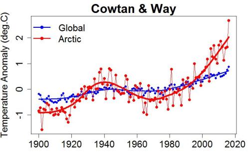 | Their estimate of Arctic heating is considerably bigger than NASA's. It indicates that between 1900 and 2015, Arctic temperature has risen about 2.9 °C (5.3 °F). | | | Source: Tamino | | URL: https://tamino.wordpress.com/2016/12/14/arctic/ |
| Change in average surface temperature (1986-2005 and 2081-2100) | 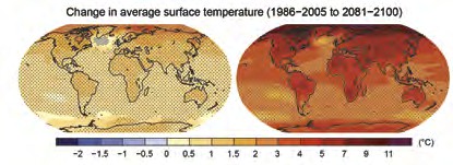 | Change in average surface temperature (1986-2005 and 2081-2100) | | | Source: NAS |
| El Niño/La Niña Global Surface Temperature Influence - 1967-2012 | | Snce El Nino and La Nina have such an impact on global atmospheric temperatures, the best way to look at the atmospheric temperature change is to categorize the global temperature by “type of year”, which indicates that the atmospheric temperatures have been increasing at the same steady rate (about .16°C /decade) since 1970 |  | | | Source: wunderground.com | | URL: http://www.wunderground.com/blog/JeffMasters/comment.html?entrynum=2374 |
| Energy absorbed by the Earth 1970-2010 - Most of the heat is going into the oceans | | As a result of the increase in atmospheric CO2, the Earth has been absorbing an excess of about 8 zeta joules of energy/year (the equivalent of a 50 megaton nuclear bomb being exploded every 15 minutes), with almost all of the energy going in to warming the oceans. | 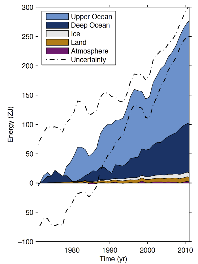
(Box 3.1 Fig 1) Plot of energy accumulation in zettajoules within distinct components of Earth’s climate system relative to 1971 and from 1971–2010 unless otherwise indicated. Ocean warming (heat content change) dominates, with the upper ocean (light blue, above 700 m) contributing more than the deep ocean (dark blue, below 700 m; including below 2000 m estimates starting from 1992). Ice melt (light grey; for glaciers and ice caps, Greenland and Antarctic ice sheet estimates starting from 1992, and Arctic sea ice estimate from 1979–2008); continental (land) warming (orange); and atmospheric warming (purple; estimate starting from 1979) make smaller contributions. Uncertainty in the ocean estimate also dominates the total uncertainty (dot-dashed lines about the error from all five components at 90% confidence intervals). | The oceans have a huge thermal mass compared to the atmosphere and land surface. They act as the planet’s heat storage and transportation system, as the ocean currents redistribute the heat. This is important because if we look at the global surface temperature as an indication of warming, we’re only getting some of the picture. The oceans act as a huge storage heater, and will continue to warm up the lower atmosphere (no matter what changes we make to the atmosphere in the future). | | | Source: johncarlosbaez | URL: http://johncarlosbaez.wordpress.com/2014/04/11/what-does-the-new-ipcc-report-say-about-climate-change-part-4/
(The text for the image(s) on this Web page was taken from the above source.) |
| GHG Concentration Stabilization Level vs Average Temperature Increase | 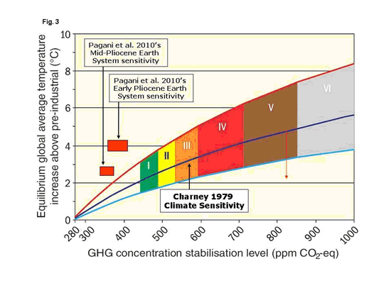
Equilibrium global average temperature increase above pre-industrial (oC) vs greenhouse gas concentration stabilization level (ppm CO2-eq). Plot represents Charney’s (1979) climate sensitivity relation of 3±1.5oC and red squares regions of Pagani et al.’s (2010) early and mid-Pliocene climate sensitivity relations. Colored zones I to VI represent various CO2 stabilization targets | “Charney 1979 Climate Senstivity” is about 3oC for a doubling of CO2. The range shown is for climate sensitivities of 1.5 to 4.5. | | | Source: http://joannenova.com.au/ | | URL: http://joannenova.com.au/2010/05/debate-part-5-the-planetary-atmosphere-and-climate-change/ |
| Global
Mean Anomaly | 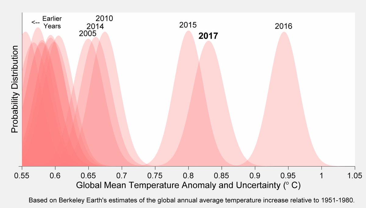
Berkeley Earth has a good summary of their 2017 results. http://berkeleyearth.org/global-s-2017/ ... This figure makes clear just how much warmer the last
three years have been: | | | Source: Twitter - Gavin
Schmidt @ClimateOfGavin |
| Global average surface temperature rise for the four RCPs | 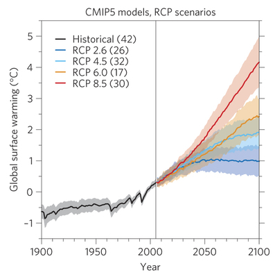
Global average surface temperature rise relative to the 1986-2005 average under new Representative Concentration Pathways. Source: Knutti & Sedlácek, 2012 | Newer studies use different types of scenarios, called Representative Concentration Pathways (RCPs), to predict future climate change. Climate models using the highest of these new concentration pathways, called RCP8.5, suggests four degrees warming as a best estimate for a world scenario where little or no mitigation action is taken. | | | Source: carbonbrief | URL: http://www.carbonbrief.org/blog/2012/11/what-is-a-4%C2%B0c-world
(The text for the image(s) on this Web page was taken from the above source.) |
| Global average temperature estimates for the last 540 My |  | This shows estimates of global average surface air temperature over the ~540 My of the Phanerozoic, since the first major proliferation of complex life forms on our planet. A substantial achievement of the last 30 years of climate science has been the production of a large set of actual measurements of temperature history (from physical proxies), replacing much of the earlier geological induction (i.e. informed guesses). The graph shows selected proxy temperature estimates, which are detailed below.
Because many proxy temperature reconstructions indicate local, not global, temperature -- or ocean, not air, temperature -- substantial approximation may be involved in deriving these global temperature estimates. As a result, the relativities of some of the plotted estimates are approximate, particularly the early ones. | | | Source: Wikipedia | | URL: http://en.wikipedia.org/wiki/File:All_palaeotemps.png |
| Global Deep Open Temperatures Last 65 Million years | 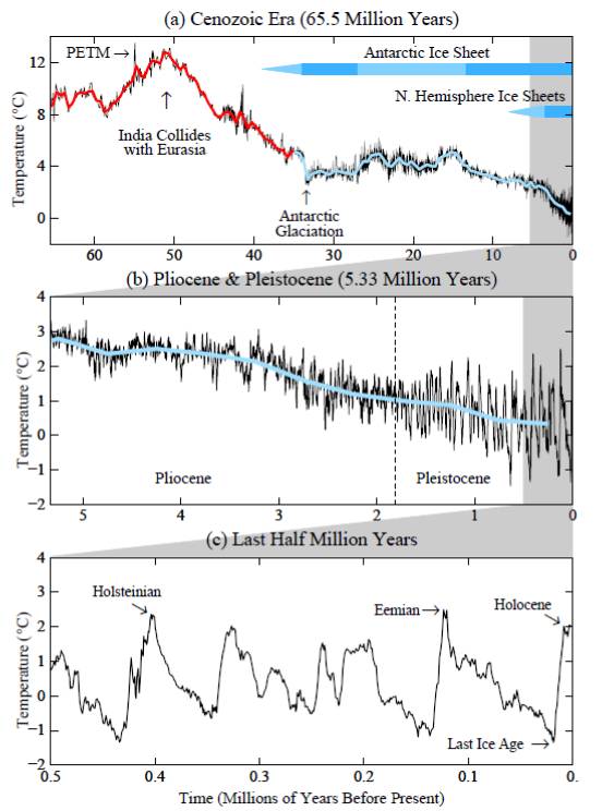
Fig. 1. Global deep ocean temperature in the Cenozoic Era, with th
e Pliocene and Pleistocene expanded
in (b) and the last half million years further expanded in (c).
H
igh frequency variations (black) are 5
-
point running means of original data (Zachos et al., 2001), while the red and blue curves have 500 ky
resolution.
Blue bars indicating ice sheet presence are darker when ice sheet
s were close to their full size | | | URL: http://www.columbia.edu/~jeh1/mailings/2011/20110118_MilankovicPaper.pdf |
| Global Temperature and Carbon Dioxide - 1880-2012 | 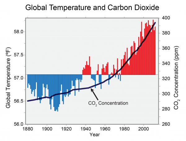
The Global Surface Temperature is Rising
Global annual average temperature measured over land and oceans. Red bars indicate temperatures above and blue bars indicate temperatures below the 1901-2000 average temperature. The black line shows atmospheric carbon dioxide concentration in parts per million. | Global average temperature is one of the most-cited indicators of global climate change, and shows an increase of approximately 1.4°F since the early 20th Century. The global surface temperature is based on air temperature data over land and sea-surface temperatures observed from ships, buoys and satellites. There is a clear long-term global warming trend, while each individual year does not always show a temperature increase relative to the previous year, and some years show greater changes than others. These year-to-year fluctuations in temperature are due to natural processes, such as the effects of El Ninos, La Ninas, and the eruption of large volcanoes. Notably, the 20 warmest years have all occurred since 1981, and the 10 warmest have all occurred in the past 12 years. | | | Source: NOAA | URL: https://www.globalchange.gov/
(The text for the image(s) on this Web page was taken from the above source.) |
| Global temperature with trends for El Niño | 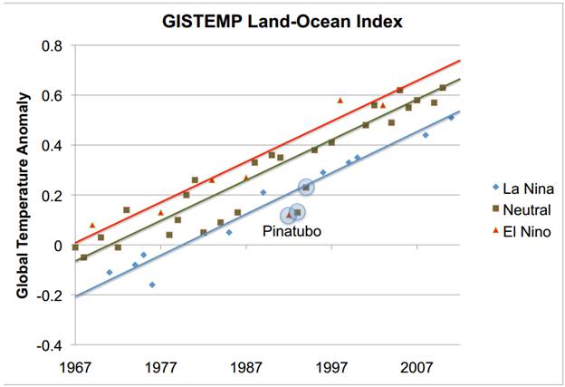
GISTemp global temperatures, with trends for El Niño, neutral, and La Niña years computed separately. Pinatubo years are excluded. | There aren’t that many full-blown El Niño events, but global temperatures during El Niños seem to be following a steady upward trend. There are more La Niña events, and those global temperatures also clearly follow a steady upward trend. Finally, the temperatures during the many neutral years also show no sign of departing from a steady upward trend. There’s enough scatter in the neutral years that if one had considered the period 1977-1987, or the period 1987-1997, one might be tempted to say that the neutral years had little or no warming. But the past decade fits nicely with the long-term upward trend of 0.16 C/decade shown by all three time series. | | | Source: Houston Chronicle | URL: http://blog.chron.com/climateabyss/2012/04/about-the-lack-of-warming/
(The text for the image(s) on this Web page was taken from the above source.) |
| Impact of ENSO
on NASA analysis |  | Some questions about the role of ENSO in
setting records in annual s. We know the El Niño warms the global mean, La Niña
cools it, but what happens when statistically correct for that? | | | Source: Twitter - Gavin
Schmidt @ClimateOfGavin |
| increase of
1.5° C in 2029 | 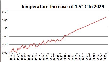
Shows how
the increase of 1.5°C could be breached
in 2015 | | | Source: Chesapeake
Data Systems |
| National Academy of Sciences - Climate Change: Evidence and Causes | | Is the climate warming? | 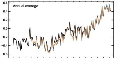
figure1. Earth’s global average
surface temperature has risen as
shown in this plot of combined
land and ocean measurements
from 1850 to 2012, derived from
three independent analyses of the
available data sets. The temperature
changes are relative to the global
average surface temperature of
1961-1990. Source: IPCC AR5, data from
the HadCRUT4 dataset (black), UK Met
Office Hadley Centre, the NCDC MLOST
dataset (orange), US National Oceanic
and Atmospheric Administration, and the
NASA GISS dataset (blue), US National
Aeronautics and Space Administration.
fff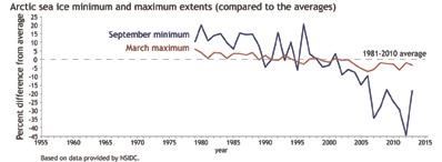
fff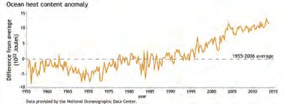
fff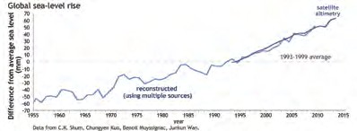
fff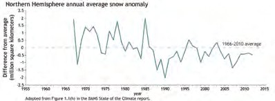
Figure 1b. A large amount of
observational evidence besides
the temperature records shows
that Earth’s climate is changing.
For example, additional evidence
of a warming trend can be found
in the dramatic decrease in the
extent of Arctic sea ice at its
summer minimum (which occurs
in September), decrease in spring
snow cover in the Northern
Hemisphere, increases in the global
average upper ocean (upper 700 m
or 2300 feet) heat content (shown
relative to the 1955–2006 average),
and in sea-level rise.
Source: NOAA climate.gov | Yes. Earth’s average surface air temperature has increased by about 0.8 °C (1.4 °F)
since 1900, with much of this increase taking place since the mid-1970s (figure 1a).
A wide range of other observations (such as reduced Arctic sea ice extent and increased
ocean heat content) and indications from the natural world (such as poleward shifts
of temperature-sensitive species of fish, mammals, insects, etc.) together provide
incontrovertible evidence of planetary-scale warming. The clearest evidence for surface warming comes from widespread thermometer records. In some places,
these records extend back to the late 19th century. Today, temperatures are monitored at many thousands
of locations, over both the land and ocean surface. Indirect estimates of temperature change from such
sources as tree rings and ice cores help to place recent temperature changes in the context of the past. In
terms of the average surface temperature of Earth, these indirect estimates show that 1983 to 2012 was
probably the warmest 30-year period in more than 800 years.
A wide range of other observations provides a more comprehensive picture of warming throughout the
climate system. For example, the lower atmosphere and the upper layers of the ocean have also warmed,
snow and ice cover are decreasing in the Northern Hemisphere, the Greenland ice sheet is shrinking, and
sea level is rising [Figure 1b]. These measurements are made with a variety of monitoring systems, which
gives added confidence in the reality that Earth’s climate is warming. | | | Source: NAS | URL: http://dels.nas.edu/resources/static-assets/exec-office-other/climate-change-QA.pdf
(The text for the image(s) on this Web page was taken from the above source.) |
| Climate change and coronavirus: Five charts about the biggest carbon crash | | Keeping the Temperature Rise to 1.5° C | 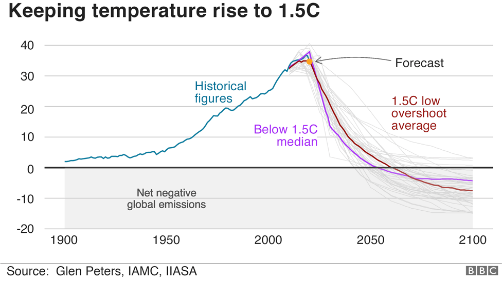
"If Covid-19 leads to a drop in emissions of around 5% in 2020, then that is the sort of reduction we need every year until net-zero emissions are reached around 2050," said Glen Peters, also from Cicero. "Such emissions reductions will not happen via lockdowns and restrictions, but by climate policies that lead to the deployment of clean technologies and reductions in demand for energy." Energy experts believe there will be a bounce back next year, but that, long term, the world will move to greener fuels. | | | URL: https://www.bbc.com/news/science-environment-52485712 |
| Projected Temperature Change of Hottest and Coldest Days | 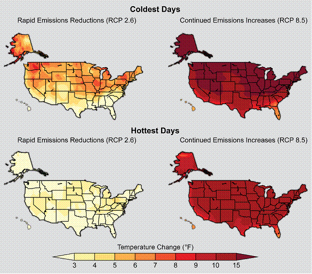 | Figure 2.20. Change in surface air temperature at the end of this century (2081-2100) relative to the turn of the last century (1986-2005) on the coldest and hottest days under a scenario that assumes a rapid reduction in heat trapping gases (RCP 2.6) and a scenario that assumes continued increases in these gases (RCP 8.5). This figure shows estimated changes in the average temperature of the hottest and coldest days in each 20-year period. In other words, the hottest days will get even hotter, and the coldest days will be less cold. (Figure source: NOAA NCDC / CICS-NC). | |
| Sea Surface Temperature - 1880-2012 | 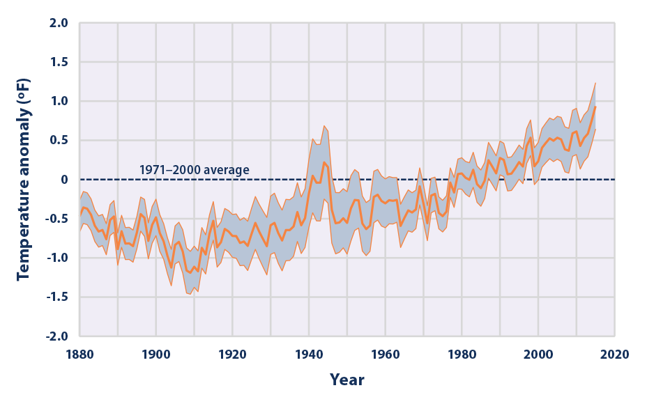
This graph shows how the average surface temperature of the world's oceans has changed since 1880. This graph uses the 1971 to 2000 average as a baseline for depicting change. Choosing a different baseline period would not change the shape of the data over time. The shaded band shows the range of uncertainty in the data, based on the number of measurements collected and the precision of the methods used. | The average surface temperature of the world's oceans has been increasing since about 1910. | | | Source: EPA | | URL: https://www.epa.gov/climate-indicators/climate-change-indicators-sea-surface-temperature |
| Separating Human and Natural Influences on Climate | 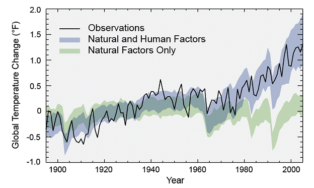
Separating Human and Natural Influences on Climate | Figure 2.3. Observed global average changes (black line), model simulations using only changes in natural factors (solar and volcanic) in green, and model simulations with the addition of human-induced emissions (blue). Climate changes since 1950 cannot be explained by natural factors or variability, and can only be explained by human factors. (Figure source: adapted from Huber and Knutti29). | | | Source: Unknown |
| IPCC 1.5° C Report | | Table 2.2 | The assessed remaining carbon budget and its uncertainties. | 
Shaded blue horizontal bands illustrate the uncertainty in historical temperature increase from the 1850–1900 base period until the 2006–2015 period as estimated from global near-surface air temperatures, which impacts the additional arming until a specific temperature limit like 1.5°C or 2°C relative to the 1850–1900 period. Shaded grey cells indicate values for when historical temperature increase is estimated from a blend of near-surface air temperatures over land and sea ice regions and sea-surface temperatures over oceans.
Notes: *(1) Chapter 1 has assessed historical warming between the 1850–1900 and 2006–2015 periods to be 0.87°C with a ±0.12°C likely (1-standard deviation) range, and global near-surface air temperature to be 0.97°C. The temperature changes from the 2006–2015 period are expressed in changes of global near-surface air temperature. *(2) Historical CO2 emissions since the middle of the 1850–1900 historical base period (mid-1875) are estimated at 1940 GtCO2 (1640–2240 GtCO2, one standard deviation range) until end 2010. Since 1 January 2011, an additional 290 GtCO2 (270–310 GtCO2 , one sigma range) has been emitted until the end of 2017 (Le Quéré et al., 2018). *(3) TCRE: transient climate response to cumulative emissions of carbon, assessed by AR5 to fall likely between 0.8–2.5°C/1000 PgC (Collins et al., 2013), considering a normal distribution consistent with AR5 (Stocker et al., 2013). Values are rounded to the nearest 10 GtCO2 . *(4) Focussing on the impact of various key uncertainties on median budgets for 0.53°C of additional warming. *(5) Earth system feedbacks include CO2 released by permafrost thawing or methane released by wetlands, see main text. *(6) Variations due to different scenario assumptions related to the future evolution of non-CO2 emissions. *(7) The distribution of TCRE is not precisely defined. Here the influence of assuming a lognormal instead of a normal distribution shown. *(8) Historical emissions uncertainty reflects the uncertainty in historical emissions since 1 January 2011. | | | URL: https://www.ipcc.ch/site/assets/uploads/sites/2/2019/05/SR15_Chapter2_Low_Res.pdf |
| Temperature Anomaly Last Ten Thousand Years | 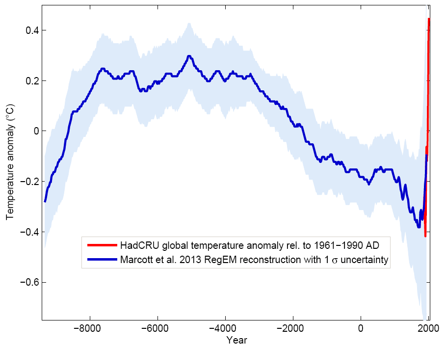
Blue curve: Global temperature reconstruction from proxy data of Marcott et al, Science 2013. Shown here is the RegEM version – significant differences between the variants with different averaging methods arise only towards the end, where the number of proxy series decreases. This does not matter since the recent temperature evolution is well known from instrumental measurements, shown in red (global temperature from the instrumental HadCRU data). Graph: Klaus Bitterman. - Click here for more information | The climate curve looks like a “hump”. At the beginning of the Holocene – after the end of the last Ice Age – global temperature increased, and subsequently it decreased again by 0.7 ° C over the past 5000 years. The well-known transition from the relatively warm Medieval into the “little ice age” turns out to be part of a much longer-term cooling, which ended abruptly with the rapid warming of the 20th Century. Within a hundred years, the cooling of the previous 5000 years was undone. - Click here for more information | | | Source: RealClimate | URL: http://www.realclimate.org/index.php/archives/2013/09/paleoclimate-the-end-of-the-holocene/
(The text for the image(s) on this Web page was taken from the above source.) |
| Temperature vs Sea Level | 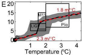
“The multimillennial sea-level commitment of global warming
Meters of sea-level rise plotted against temperature increase. Note that a 2.5 oC temperature increase will likely result in 10-15 meters (30-45 feet) of sea level rise. And even with a 2 oC temperature increase the sea level rise will likely be 10 meters (30 feet) | 1. “ Anders Levermann et al, June 2013 PNAS | | | Source: PNAS | | URL: http://www.pnas.org/content/110/34/13745.full |
|
|