Methane
This Fact Page displays text and images related to global warming and climate change
(Hover your mouse over the text below to "popup" a window with a related text.
Click on the text or image to open a new window with a detailed description.)
|
|
| Global anthropogenic emissions (excl. biomass burning) | 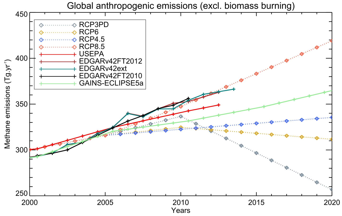
Figure 2. Global anthropogenic methane emissions (excluding biomass burning) from historical inventories and future projections (in Tg CH4 yr-1). USEPA and GAINS estimates have been linearly interpolated from the 10- or 5-year original products to yearly values. After 2005, USEPA original estimates are projections. | | | Source: Earth System Science Data | URL: http://www.earth-syst-sci-data.net/8/697/2016/essd-8-697-2016.pdf
(The text for the image(s) on this Web page was taken from the above source.) |
| National Academy of Sciences - Climate Change: Evidence and Causes | | If emissions of greenhouse gases were stopped, would the climate return to the conditions of 200 years ago? | 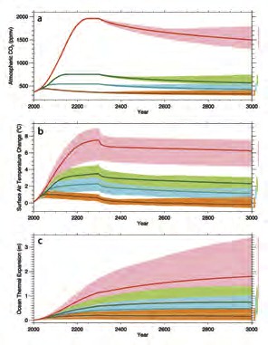
figure 9. If global emissions
were to suddenly stop, it would
take a long time for surface air
temperatures and the ocean to
begin to cool, because the excess
CO2 in the atmosphere would
remain there for a long time and
would continue to exert a warming
effect. Model projections show how
atmospheric CO2 concentration
(a), surface air temperature (b),
and ocean thermal expansion (c)
would respond following a scenario
of business-as-usual emissions
ceasing in 2300 (red), a scenario
of aggressive emission reductions,
falling close to zero 50 years from
now (orange), and two intermediate
emissions scenarios (green and
blue). The small downward tick
in temperature at 2300 is caused
by the elimination of emissions
of short-lived greenhouse gases,
including methane. Source: Zickfeld
et al., 2013 | No. Even if emissions of greenhouse gases were to suddenly stop, Earth’s surface temperature
would not cool and return to the level in the pre-industrial era for thousands of years. If emissions of CO2 stopped altogether, it would take many thousands of years for atmospheric CO2 to
return to ‘pre-industrial’ levels due to its very slow transfer to the deep ocean and ultimate burial in ocean
sediments. Surface temperatures would stay elevated for at least a thousand years, implying extremely
long-term commitment to a warmer planet due to past and current emissions, and sea level would likely
continue to rise for many centuries even after temperature stopped increasing [Figure 9]. Significant
cooling would be required to reverse melting of glaciers and the Greenland ice sheet, which formed
during past cold climates. The current CO2-induced warming of Earth is therefore essentially irreversible
on human timescales. The amount and rate of further warming will depend almost entirely on how much
more CO2 humankind emits. | | | Source: NAS | URL: http://dels.nas.edu/resources/static-assets/exec-office-other/climate-change-QA.pdf
(The text for the image(s) on this Web page was taken from the above source.) |
| Map of areas and locations for geological emissions of methane | 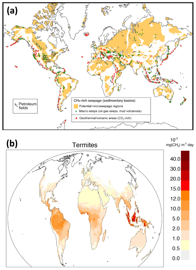
Figure 4. (a) Map of areas and locations for geological emissions of methane related to the different categories mentioned in the text (Sect. 3.2.3). (b) Climatological CH4 emissions from termites over the period 2000–2007 (Sect. 3.2.4). | | | Source: Earth System Science Data | URL: http://www.earth-syst-sci-data.net/8/697/2016/essd-8-697-2016.pdf
(The text for the image(s) on this Web page was taken from the above source.) |
| Methane Budget | 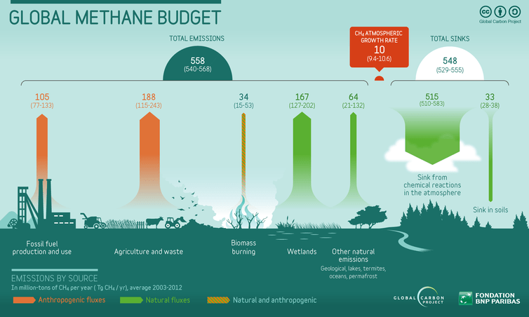
Global methane budget 2003-2012 based on Saunois et al. 2016, Earth System Science Data. See the Global Carbon Atlas at http://www.globalcarbonatlas.org. | Where does all the methane go? Methane is emitted from multiple sources, mostly from land, and accumulates in the atmosphere. In our greenhouse gas budgets, we look at two important numbers. First, we look at emissions (which activities are producing greenhouse gases). Second, we look at where this gas ends up. The important quantity here is the accumulation (concentration) of methane in the atmosphere, which leads to global warming. The accumulation results from the difference between total emissions and the destruction of methane in the atmosphere and uptake by soil bacteria. CO2 emissions take centre stage in most discussions to limit climate change. The focus is well justified, given that CO2 is responsible for more than 80% of global warming due to greenhouse gases. The concentration of CO2 in the atmosphere (now around 400 parts per million) has risen by 44% since the Industrial Revolution (around the year 1750). While CO2 in the atmosphere has increased | | | Source: The Conversation | | URL: https://theconversation.com/methane-from-food-production-might-be-the-next-wildcard-in-climate-change-69894 |
| Methane Concentration | 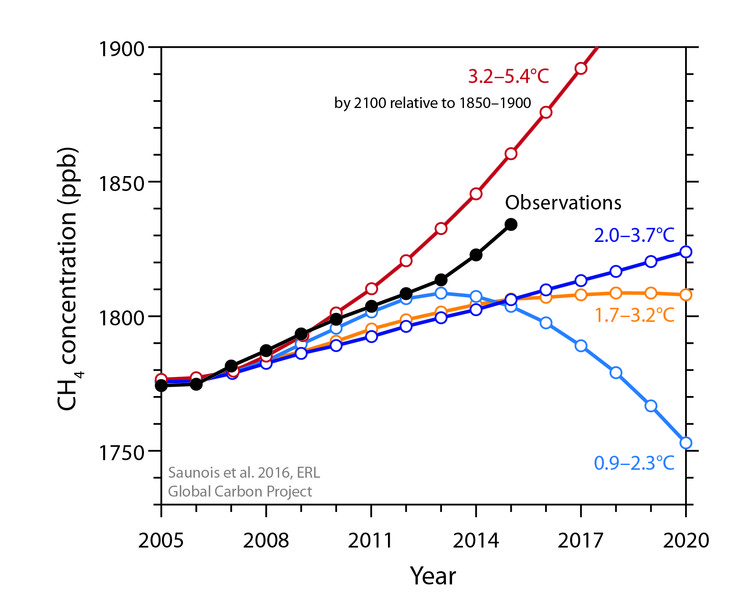
Methane concentration pathways from IPCC and observations from the NOAA measuring network (Saunois et al 2016, Environmental Research Letters). The projected global warming range by the year 2100, relative to 1850-1900, is shown for each pathway. | Methane concentrations in the atmosphere are growing faster than any time in the past 20 years. The increase is largely driven by the growth in food production, according to the Global Methane Budget released today. Methane is contributing less to global warming than carbon dioxide (CO2), but it is a very powerful greenhouse gas. Since 2014, methane concentrations in the atmosphere have begun to track the most carbon-intensive pathways developed for the 21st century by the Intergovernmental Panel on Climate Change (IPCC). The growth of methane emissions from human activities comes at a time when CO2 emissions from burning fossil fuels have stalled over the past three years. If these trends continue, methane growth could become a dangerous climate wildcard, overwhelming efforts to reduce CO2 in the short term. | | | Source: The Conversation | | URL: https://theconversation.com/methane-from-food-production-might-be-the-next-wildcard-in-climate-change-69894 |
| Methane Concentration and Growth Rate (1980-2012) | 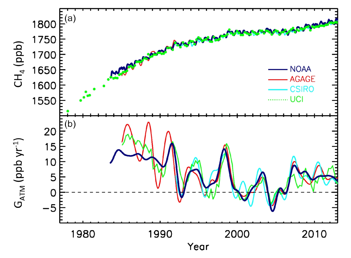
Figure 1. Globally averaged atmospheric CH4 (ppb) (a) and its annual growth rate GATM (ppb yr-1) (b) from four measure-
ment programmes: National Oceanic and Atmospheric Adminis- tration (NOAA), Advanced Global Atmospheric Gases Experiment (AGAGE), Commonwealth Scientific and Industrial Research Or- ganisation (CSIRO), and University of California, Irvine (UCI). Detailed descriptions of methods are given in the Supplement of Kirschke et al. (2013). | | | Source: Earth System Science Data | URL: http://www.earth-syst-sci-data.net/8/697/2016/essd-8-697-2016.pdf
(The text for the image(s) on this Web page was taken from the above source.) |
| Methane emissions from four source categories | 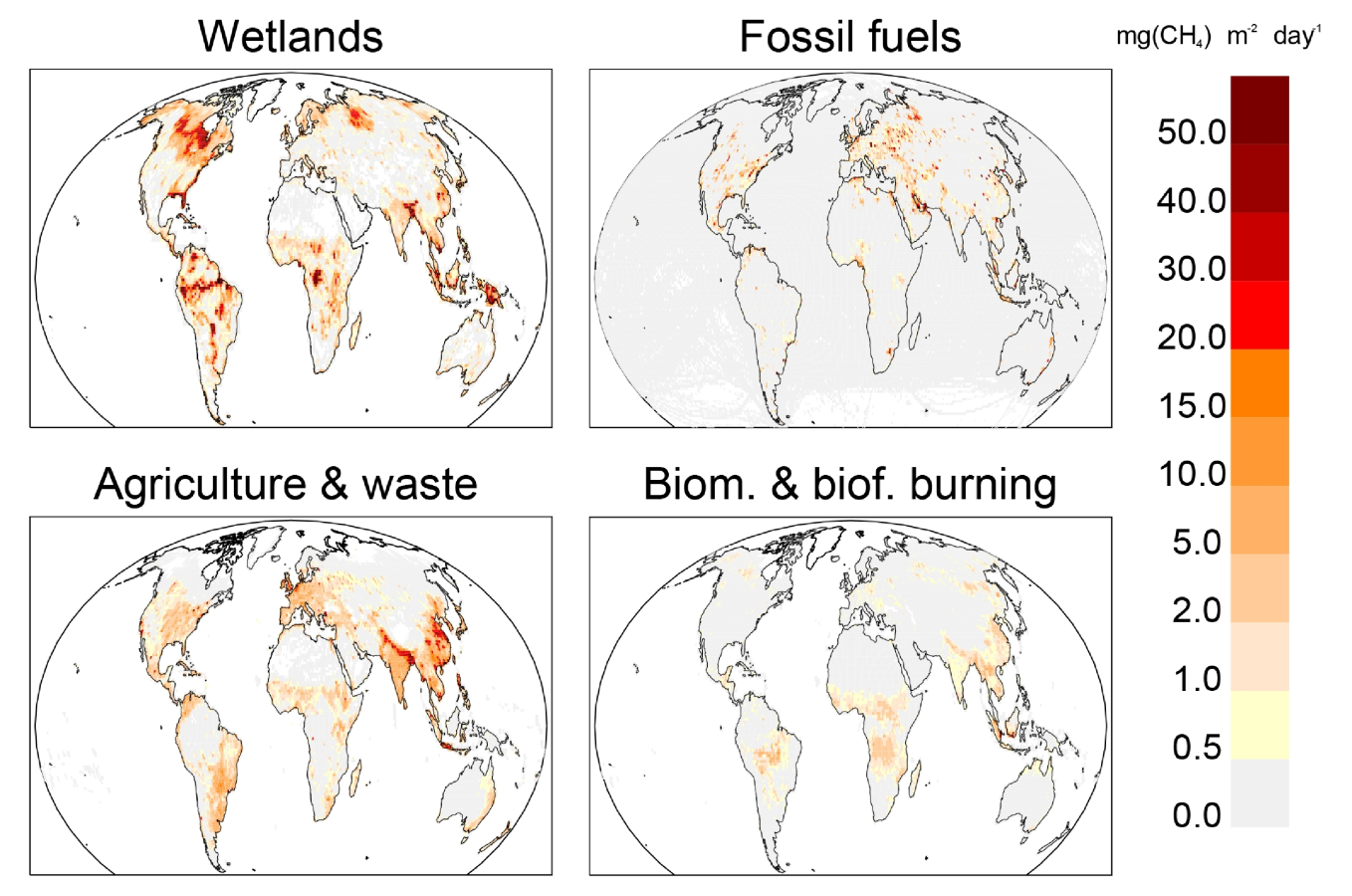
Figure 3. Methane emissions from four source categories: natural wetlands, fossil fuels, agriculture and waste, and biomass and biofuel burning for the 2003–2012 decade in mg CH4 m-2 day-1. The wetland emission map represents the mean daily emission average over the 11 biogeochemical models listed in Table 1 and over the 2003–2012 decade. Fossil fuel and agriculture and waste emission maps are derived
from the mean estimates of EDGARv4.2FT2010 and GAINS models. The biomass and biofuel burning map results from the mean of the biomass burning inventories listed in Table 1 added to the mean of the biofuel estimate from EDGARv4.2FT2010 and GAINS models. | | | Source: Earth System Science Data | URL: http://www.earth-syst-sci-data.net/8/697/2016/essd-8-697-2016.pdf
(The text for the image(s) on this Web page was taken from the above source.) |
| Methane global emissions - 2003-2012 decade | 
Figure 5. Methane global emissions from the five broad cate-
gories (see Sect. 2.3) for the 2003–2012 decade for top-down in- versions models (left light-coloured boxplots) in Tg CH4 yr-1 and for bottom-up models and inventories (right dark-coloured box-
plots). Median value, and first and third quartiles are presented in the boxes. The whiskers represent the minimum and maximum val- ues when suspected outliers are removed (see Sect. 2.2). Suspected outliers are marked with stars when existing. Bottom-up quartiles are not available for bottom-up estimates. Mean values are repre-
sented with “+” symbols; these are the values reported in Table 2. | | | Source: Earth System Science Data | URL: http://www.earth-syst-sci-data.net/8/697/2016/essd-8-697-2016.pdf
(The text for the image(s) on this Web page was taken from the above source.) |
| Regional CH4 budget in Tg CH4 yr-1 per category | 
Figure 7. Regional CH4 budget in Tg CH4 yr-1 per category (same as for the global emissions in Fig. 6) and map of the 14 continental regions considered in this study. The CH4 emissions are given for the five categories from left to right (wetlands, biomass burning, fossil fuels, agriculture and waste, and other natural). Top-down estimates are given by the left dark-coloured boxes and bottom-up estimates by the right light-coloured boxes. | | | Source: Earth System Science Data | URL: http://www.earth-syst-sci-data.net/8/697/2016/essd-8-697-2016.pdf
(The text for the image(s) on this Web page was taken from the above source.) |
| Regional methane emissions - 2003-2012 decade | 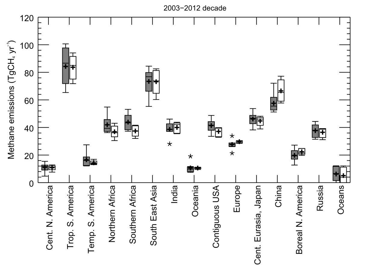
Figure 6. Regional methane emissions for the 2003–2012 decade from top-down inversions (grey) and for the prior estimates used in the inversions (white). Each boxplot represents the range of the top-down estimates inferred by the ensemble of inversion approach. Median value, and first and third quartiles are presented in the box. The whiskers represent the minimum and maximum values when suspected outliers are removed (see Sect. 2.2). Outliers are marked with stars when existing. Mean values are represented with “+” symbols; these are the values reported in Table 4. | | | Source: Earth System Science Data | URL: http://www.earth-syst-sci-data.net/8/697/2016/essd-8-697-2016.pdf
(The text for the image(s) on this Web page was taken from the above source.) |
| IPCC 1.5° C Report | | Table 2.2 | The assessed remaining carbon budget and its uncertainties. | 
Shaded blue horizontal bands illustrate the uncertainty in historical temperature increase from the 1850–1900 base period until the 2006–2015 period as estimated from global near-surface air temperatures, which impacts the additional arming until a specific temperature limit like 1.5°C or 2°C relative to the 1850–1900 period. Shaded grey cells indicate values for when historical temperature increase is estimated from a blend of near-surface air temperatures over land and sea ice regions and sea-surface temperatures over oceans.
Notes: *(1) Chapter 1 has assessed historical warming between the 1850–1900 and 2006–2015 periods to be 0.87°C with a ±0.12°C likely (1-standard deviation) range, and global near-surface air temperature to be 0.97°C. The temperature changes from the 2006–2015 period are expressed in changes of global near-surface air temperature. *(2) Historical CO2 emissions since the middle of the 1850–1900 historical base period (mid-1875) are estimated at 1940 GtCO2 (1640–2240 GtCO2, one standard deviation range) until end 2010. Since 1 January 2011, an additional 290 GtCO2 (270–310 GtCO2 , one sigma range) has been emitted until the end of 2017 (Le Quéré et al., 2018). *(3) TCRE: transient climate response to cumulative emissions of carbon, assessed by AR5 to fall likely between 0.8–2.5°C/1000 PgC (Collins et al., 2013), considering a normal distribution consistent with AR5 (Stocker et al., 2013). Values are rounded to the nearest 10 GtCO2 . *(4) Focussing on the impact of various key uncertainties on median budgets for 0.53°C of additional warming. *(5) Earth system feedbacks include CO2 released by permafrost thawing or methane released by wetlands, see main text. *(6) Variations due to different scenario assumptions related to the future evolution of non-CO2 emissions. *(7) The distribution of TCRE is not precisely defined. Here the influence of assuming a lognormal instead of a normal distribution shown. *(8) Historical emissions uncertainty reflects the uncertainty in historical emissions since 1 January 2011. | | | URL: https://www.ipcc.ch/site/assets/uploads/sites/2/2019/05/SR15_Chapter2_Low_Res.pdf |
|
|